Plotting routines
In past releases of PySPEDAS, plotting utilities, and many other tools that work with tplot variables, were imported from the external pytplot-mpl-temp package. As of PySPEDAS 2.0, they are now bundled with PySPEDAS.
Plotting
tplot is the top level plotting routine. It uses the matplotlib plotting library to render plots of tplot variables.
- pyspedas.tplot(variables, trange=None, var_label=None, xsize=None, ysize=None, save_png='', save_eps='', save_svg='', save_pdf='', save_jpeg='', dpi=None, display=True, fig=None, axis=None, running_trace_count=None, pseudo_idx=None, pseudo_right_axis=False, pseudo_xaxis_options=None, pseudo_yaxis_options=None, pseudo_zaxis_options=None, pseudo_line_options=None, pseudo_extra_options=None, show_colorbar=True, slice=False, return_plot_objects=False)[source]
Plot tplot variables to the display, or as saved files, using Matplotlib
- Parameters:
variables (
strorlistofstr,required) – List of tplot variables to be plotted. Space-delimited strings may be used instead f lists. Wildcards will be expanded.trange (
listofstringorfloat, optional) – If set, this time range will be used, temporarily overriding any previous xlim or timespan callsvar_label (
strorlistofstr, optional) – A list of variables to be displayed as values underneath the X axis major tick marksxsize (
float, optional) – Plot size in the horizontal direction (in inches)ysize (
float, optional) – Plot size in the vertical direction (in inches)dpi (
float, optional) – The resolution of the plot in dots per inchsave_png (
str, optional) – A full file name and path. If this option is set, the plot will be automatically saved to the file name provided in PNG format.save_eps (
str, optional) – A full file name and path. If this option is set, the plot will be automatically saved to the file name provided in EPS format.save_jpeg (
str, optional) – A full file name and path. If this option is set, the plot will be automatically saved to the file name provided in JPEG format.save_pdf (
str, optional) – A full file name and path. If this option is set, the plot will be automatically saved to the file name provided in PDF format.save_svg (
str, optional) – A full file name and path. If this option is set, the plot will be automatically saved to the file name provided in SVG format.dpi (
float, optional) – The resolution of the plot in dots per inchdisplay (
bool, optional) – If True, then this function will display the plotted tplot variables. Use False to suppress display (for example, if saving to a file, or returning plot objects to be displayed later). Default: Truefig (
Matplotlib figure object) – Use an existing figure to plot in (mainly for recursive calls to render composite variables)axis (
Matplotlib axes object) – Use an existing set of axes to plot on (mainly for recursive calls to render composite variables)running_trace_count (
int, optional) – In recursive calls for rendering composite variables, the index of the trace currently being rendered.pseudo_idx (
int, optional) – In recursive calls for rendering composite variables, the index of the variable component currently being rendered.pseudo_right_axis (
bool, optional) – In recursive calls for rendering composite variables, a flag to indicate the Y scale should be placed on the right Y axis.pseudo_xaxis_options (
dict, optional) – In recursice calls for rendering composite variables, X axis options inherited from the parent variablepseudo_yaxis_options (
dict, optional) – In recursive calls for rendering composite variables, Y axis options inherited from the parent variablepseudo_zaxis_options (
dict, optional) – In recursive calls for rendering composite variables, Z axis options inherited from the parent variablepseudo_line_options (
dict, optional) – In recursive calls for rendering composite variables, line options inherited from the parent variablepseudo_extra_options (
dict, optional) – In recursive calls for rendering composite variables, extra options inherited from the parent variableshow_colorbar (
bool, optional) – Show a colorbar showing the Z scale for spectrogram plots.slice (
bool, optional) – If True, show an interactive window with a plot of Z versus Y values for the X axis (time) value under the cursor. Default: Falsereturn_plot_objects (
bool, optional) – If true, returns the matplotlib fig and axes objects for further manipulation. Default: False
- Returns:
Returns matplotlib fig and axes objects, if return_plot_objects==True
- Return type:
Any
Examples
>>> # Plot a single line plot
>>> import pyspedas
>>> x_data = [2,3,4,5,6]
>>> y_data = [1,2,3,4,5]
>>> pyspedas.store_data("Variable1", data={'x':x_data, 'y':y_data})
>>> pyspedas.tplot("Variable1")
>>> # Plot two variables
>>> x_data = [1,2,3,4,5]
>>> y_data = [[1,5],[2,4],[3,3],[4,2],[5,1]]
>>> pyspedas.store_data("Variable2", data={'x':x_data, 'y':y_data})
>>> pyspedas.tplot(["Variable1", "Variable2"])
>>> # Plot two plots, adding a third variable's values as annotations at X axis major tick marks
>>> x_data = [1,2,3]
>>> y_data = [ [1,2,3] , [4,5,6], [7,8,9] ]
>>> v_data = [1,2,3]
>>> pyspedas.store_data("Variable3", data={'x':x_data, 'y':y_data, 'v':v_data})
>>> pyspedas.options("Variable3", 'spec', 1)
>>> pyspedas.tplot(["Variable2", "Variable3"], var_label='Variable1')
lineplot is a line plotting routine called by tplot. It is not usually called by users, but is documented here for completeness.
- pyspedas.lineplot(var_data, var_times, this_axis, line_opts, yaxis_options, plot_extras, running_trace_count=None, time_idxs=None, style=None, var_metadata=None)[source]
Generate a matplotlib line plot from a tplot variable
- Parameters:
var_data (
dict) – The data to be plotted (may have multiple traces)var_times – Array of datetime objects to use for x axis
this_axis – The current axis (plot panel) we’re working with
line_opts (
dict) – A dictionary of line optionsyaxis_options (
dict) – A dictionary of y axis optionsplot_extras (
dict) – A dictionary of ‘extra’ options (colors, etc)running_trace_count – If not Null, an integer representing the number of traces already processed in this pseudovariable. Defaults to None.
time_idxs (
np.ndarray) – If provided, an integer array specifying the subset of time indices to be plotted. Defaults to None.style – A matplotlib style to be used in the plot. Defaults to None.
var_metadata (
dict) – The metadata dictionary associated with this tplot variable (used as a fallback for trace labels). Defaults to None.
- Return type:
specplot is a spectrogram plotting routine called by tplot. It is not usually called by users, but is docuemented here for completeness.
- pyspedas.specplot(var_data, var_times, this_axis, yaxis_options, zaxis_options, plot_extras, colorbars, axis_font_size, fig, variable, time_idxs=None, style=None)[source]
Plot a tplot variable as a spectrogram
- Parameters:
var_data (
dict) – A tplot dictionary containing the data to be plottedvar_times (
arrayofdatetime objects) – An array of datetime objects specifying the time axisthis_axis – The matplotlib object for the panel currently being plotted
yaxis_options (
dict) – A dictionary containing the Y axis options to be used for this variablezaxis_options (
dict) – A dictionary containing the Z axis (spectrogram values) options to be used for this variableplot_extras (
dict) – A dictionary containing additional plot options for this variablecolorbars (
dict) – The data structure that contains information (for all variables) for creating colorbars.axis_font_size (
int) – The font size in effect for this axis (used to create colorbars)fig (
matplotlib.figure.Figure) – A matplotlib figure object to be used for this plotvariable (
str) – The name of the tplxxot variable to be plotted (used for log messages)time_idxs (
arrayofint) – The indices of the subset of times to use for this plot. Defaults to None (plot all timestamps).style – A matplotlib style object to be used for this plot. Defaults to None.
- Return type:
Time Windowing and Plot Limits
- pyspedas.tlimit(arg=None, full=False, last=False)[source]
- Parameters:
arg (
strorlist) – If arg==’full’, revert to the full time range. If arg==’last’, revert to the previous time range. Otherwise, arg should be a list containing a start and stop time.full (
bool) – If True, revert to the full time range. Equivalent to tlimit(‘full’).last (
bool:) – If True, revert to the previous time range. Equivalent to tlimit(‘last’).
- Return type:
Examples
>>> import pyspedas
>>> pyspedas.tlimit(['2023/03/24/', '2023/03/25'])
- pyspedas.timespan(t1=None, dt=None, units='days', keyword=None, reset=False)[source]
This function will set the time range for all time series plots. This is a wrapper for the function “xlim” to better handle time axes.
- Parameters:
t1 (
floatorstr) – The time to start all time series plots. Can be given in seconds since epoch, or as a string in the format “YYYY-MM-DD HH:MM:SS”.dt (
float) – The time duration of the plots. Default is number of days.units (
str, optional) – Sets the units of the “dt” variable. Days, hours, minutes, and seconds and reasonable abbreviations are all accepted. Default is ‘days’.keyword (
str, optional) – Synonym for units keywordreset (
bool, optional) – If True, clears all previously set time ranges.
- Return type:
Examples
>>> # Set the timespan to be 2017-07-17 00:00:00 plus 1 day
>>> import pyspedas
>>> pyspedas.timespan(1500249600, 1)
>>> # The same as above, but using different inputs
>>> pyspedas.timespan("2017-07-17 00:00:00", 24, units='hours')
- pyspedas.xlim(min, max)[source]
This function will set the x axis range for all time series plots
- Parameters:
min (
flt) – The time to start all time series plots. Can be given in seconds since epoch, or as a string in the format “YYYY-MM-DD HH:MM:SS”max (
flt) – The time to end all time series plots. Can be given in seconds since epoch, or as a string in the format “YYYY-MM-DD HH:MM:SS”
- Return type:
Examples:
>>> # Set the timespan to be 2017-07-17 00:00:00 plus 1 day
>>> import pyspedas
>>> pyspedas.xlim(1500249600, 1500249600 + 86400)
>>> # The same as above, but using different inputs
>>> pyspedas.xlim("2017-07-17 00:00:00", "2017-07-18 00:00:00")
- pyspedas.ylim(name, min, max, logflag=None)[source]
This function will set the y axis range displayed for a specific tplot variable.
- Parameters:
name (
str,int,listofstr,listofint) – The names, indices, or wildcard patterns of the tplot variable that you wish to set y limits for.min (
flt) – The start of the y axis.max (
flt) – The end of the y axis.logflag (
bool) – (Optional) If True, the y axis will be logarithmic scale, if False, linear scale, if None, no change
- Return type:
Examples
>>> # Change the y range of Variable1
>>> import pyspedas
>>> x_data = [1,2,3,4,5]
>>> y_data = [1,2,3,4,5]
>>> pyspedas.store_data("Variable1", data={'x':x_data, 'y':y_data})
>>> pyspedas.ylim('Variable1', 2, 4)
- pyspedas.zlim(name, min, max, logflag=None)[source]
This function will set the z axis range displayed for a specific tplot variable. This is only used for spec plots, where the z axis represents the magnitude of the values in each bin.
- Parameters:
name (
str,int,listofstr,listofint) – The names, indices, or wildcard patterns of the tplot variable that you wish to set z limits for.min (
flt) – The start of the z axis.max (
flt) – The end of the z axis.logflag (
bool) – (Optional) If True, use logarithmic scale; if False, linear scale, if None, no change
- Return type:
Examples
>>> # Change the z range of Variable1
>>> import pyspedas
>>> x_data = [1,2,3]
>>> y_data = [ [1,2,3] , [4,5,6], [7,8,9] ]
>>> v_data = [1,2,3]
>>> pyspedas.store_data("Variable3", data={'x':x_data, 'y':y_data, 'v':v_data})
>>> pyspedas.zlim('Variable1', 2, 3)
Interactive Time Selection from Plots
The ctime routine is a close analogue of the IDL SPEDAS tool. A call to tplot() with return_plot_objects=True will return Matplotlib figure and axis objects that can be passed to ctime. During a call to ctime, a vertical time bar will track the cursor location within the plot. Left-clicking will save that timestamp to the output list; after selecting the desired number of points, the user can right-click to quit. ctime will then return the list of timestamps selected.
At the moment, ctime does not work reliably in a Jupyter notebook when the matplotlib ‘ipympl’ backend is used, or with the default ‘inline’ non-interactive back end. If you are developing a notebook which calls ctime, we recommend specifying the ‘auto’ backend (via the ‘magic’ command “%matplotlib auto”) before importing or calling any pyspedas or matplotlib routines.
- pyspedas.ctime(fig)[source]
Select time values by clicking on a plot, similar to ctime in IDL SPEDAS
Left click saves the time at the current cursor position. ‘c’, ‘e’, or shift-left click clears the list of times selected. Right click or ‘q’ exits and returns the list of saved times (as floating point Unix times).
- Parameters:
fig – A matplotlib fig object specifying the plot to be used for the time picker (returned by tplot with return_plot_objects=True)
Notes
This feature is very platform-dependent, and should still be considered experimental. Please let the PySPEDAS developers know if you have trouble using it in your environment.
As of this release, ctime seems to work in most situations, except for Jupyter notebooks using the ‘ipympl’ (aka ‘widget’) matplotlib backend. With that backend, the most common failure modes are that the ctime() call returns immediately, with no chance to interact with the plot, or the tplot call gets stuck somehow and never renders the plot.
We are working on a fix for the ipympl incompatibility, but for now, the best workaround for Jupyter notebooks may be to use “%matplotlib auto” as the backend. Depending on your exact environment, this will probably render the plots outside of the Jupyter notebooks (so the plot results won’t be saved in the notebook), but at least ctime should work, allowing you to continue with your desired workflow.
- Returns:
The selected times as floating point Unix times (in seconds)
- Return type:
listofdouble
Examples
>>> import pyspedas
>>> from pyspedas import tplot, ctime, time_string
>>> pyspedas.projects.themis.state(probe='a')
>>> myfig, ax = tplot('tha_pos', return_plot_objects=True)
>>> saved_timestamps = ctime(myfig)
>>> print(time_string(saved_timestamps))
Non-time-series plots
PySPEDAS now has the ability to generate certain kinds of non-time-series plots which involve projecting 3-D position or field data onto one or more of the coordinate system planes. Examples include orbit plots, field line traces, or hodograms.
The tplotxy routine projects one or more 3-d input variables onto one of the 2D coordinate system planes: xy, xz, or yz.
The tplotxy3 routine projects and plots the input data onto all three coordinate planes in a single figure. It also includes several features that are useful for orbit plots: once the initial figure is created, one can add traces for bow shock, magnetopause boundaries, or neutral sheet locations by passing the boundary data and the Matplotlib figure object to a helper routine to add the new traces.
- pyspedas.tplotxy(tvars, plane='xy', center_origin=True, reverse_x=False, reverse_y=False, plot_units='re', title=None, colors=('k', 'b', 'g', 'r', 'c', 'm', 'y'), linestyles='solid', linewidths=None, markers=None, startmarkers=None, endmarkers=None, markevery=10, markersize=5, legend_names=None, legend_location='upper right', show_centerbody=True, centerbody_size_re=1.0, save_png='', save_eps='', save_jpeg='', save_pdf='', save_svg='', dpi=300, display=True, fig=None, axis=None)[source]
Plot one or more 3d tplot variables, by projecting them onto one of the coordinate planes XY, XY, or YZ.
- Parameters:
tvars (
stringorlistofstrings) – Tplot variables to be plotted (wildcards accepted). The data array should be ntimesx3, or in the case of field line plots, ntimesxnpointsx3plane (
stringorlistofstrings) – Plane to project the 3d vectors onto. Valid options: ‘xy’, ‘xz’, ‘yz’. Default: ‘xy’center_origin (
bool) – If True, center the plot on the origin.reverse_x (
bool) – If True, reverse the x-axis of the plot (more positive values to the left). This is handy for GSE-like orbit plots if you want the sun depicted toward the leftreverse_y (
bool) – If True, reverse the y-axis of the plot (more positive values to the bottom) If reverse_x is set, and you’re projecting onto the xy plane, this keeps the coordinate system right-handed.colors (
listortupleofstrings) – Colors to use if multiple variables are plotted. Default: (‘k’, ‘b’, ‘g’, ‘r’, ‘c’, ‘m’, ‘y’). If number of variables exceeds number of colors, they will cycle.linestyles (
listortupleofstrings) – Line styles to use for each variable. Default: (‘solid’). If number of variables exceeds number of linestyles, they will cycle.linewidths (
listortupleofstrings) – Line widths to use for each variable. If number of variables exceeds number of linewidths, they will cycle. Default: (None) (use matplotlib default)markers (
listortupleofstr) – marker style for the data points (default: (None))startmarkers (
listortupleofstr) – marker style for the start of each trace (default: (None))endmarkers (
listortupleofstr) – marker style for the end of each trace (default: (None))markevery (
intorsequenceofint) – plot a marker at every n-th data point (default: 10)markersize (
float) – size of the marker in points (default: 5)legend_names (
listofstr) – If set, labels to use in the plot legend.legend_location (
str) – Placement of legend relative to the plot window.show_centerbody (
bool) – If True, draw the central body at the origincenterbody_size_re (
float) – The size in Re of the center body. Default: 1.0save_png (
str, optional) – A full file name and path. If this option is set, the plot will be automatically saved to the file name provided in PNG format.save_eps (
str, optional) – A full file name and path. If this option is set, the plot will be automatically saved to the file name provided in EPS format.save_jpeg (
str, optional) – A full file name and path. If this option is set, the plot will be automatically saved to the file name provided in JPEG format.save_pdf (
str, optional) – A full file name and path. If this option is set, the plot will be automatically saved to the file name provided in PDF format.save_svg (
str, optional) – A full file name and path. If this option is set, the plot will be automatically saved to the file name provided in SVG format.dpi (
float, optional) – The resolution of the plot in dots per inchdisplay (
bool, optional) – If True, then this function will display the plotted tplot variables. Use False to suppress display (for example, if saving to a file, or returning plot objects to be displayed later). Default: Truefig (
Matplotlib figure object) – Use an existing figure to plot in (mainly for recursive calls to render composite variables)axis (
Matplotlib axes object) – Use an existing set of axes to plot on (mainly for recursive calls to render composite variables)
- Return type:
- pyspedas.tplotxy3(tvars, center_origin=True, reverse_x=False, plot_units='re', title=None, colors=('k', 'b', 'g', 'r', 'c', 'm', 'y'), linestyles='solid', linewidths=None, markers=None, startmarkers=None, endmarkers=None, markevery=10, markersize=5, legend_names=None, show_centerbody=True, centerbody_size_re=1.0, save_png='', save_eps='', save_jpeg='', save_pdf='', save_svg='', dpi=300, display=True, fig=None, axis=None)[source]
Plot one or more 3d tplot variables, by projecting them onto the three coordinate axes planes in a single figure.
- Parameters:
tvars (
stringorlistofstrings) – Tplot variables to be plotted (wildcards accepted). The data array should be ntimesx3, or in the case of field line plots, ntimesxnpointsx3center_origin (
bool) – If True, center the plot on the origin.reverse_x (
bool) – If True, reverse the x-axis of the plot (more positive values to the left). For plots in GSE-like coordinates, this puts the sun to the left instead of the right. It will also reverse the Y axis of the upper left (XY) plot.plot_units (
str) – The units to use for the plot (default: ‘re’).title (
str) – The title to use for the plot.colors (
listortupleofstrings) – Colors to use if multiple variables are plotted. Default: (‘k’, ‘b’, ‘g’, ‘r’, ‘c’, ‘m’, ‘y’). If number of variables exceeds number of colors, they will cycle.linestyles (
listortupleofstrings) – Line styles to use for each variable. Default: (‘solid’). If number of variables exceeds number of linestyles, they will cycle.linewidths (
listortupleofstrings) – Line widths to use for each variable. If number of variables exceeds number of linewidths, they will cycle. Default: (None) (use matplotlib default)markers (
listortupleofstr) – marker style for the data points (default: (None))startmarkers (
listortupleofstr) – marker style for the start of each trace (default: (None))endmarkers (
listortupleofstr) – marker style for the end of each trace (default: (None))markevery (
intorsequenceofint) – plot a marker at every n-th data point (default: 10)markersize (
float) – size of the marker in points (default: 5)legend_names (
listofstr) – If set, labels to use in the plot legend.show_centerbody (
bool) – If True, draw the central body at the origincenterbody_size_re (
float) – The size in Re of the center body. Default: 1.0save_png (
str, optional) – A full file name and path. If this option is set, the plot will be automatically saved to the file name provided in PNG format.save_eps (
str, optional) – A full file name and path. If this option is set, the plot will be automatically saved to the file name provided in EPS format.save_jpeg (
str, optional) – A full file name and path. If this option is set, the plot will be automatically saved to the file name provided in JPEG format.save_pdf (
str, optional) – A full file name and path. If this option is set, the plot will be automatically saved to the file name provided in PDF format.save_svg (
str, optional) – A full file name and path. If this option is set, the plot will be automatically saved to the file name provided in SVG format.dpi (
float, optional) – The resolution of the plot in dots per inchdisplay (
bool, optional) – If True, then this function will display the plotted tplot variables. Use False to suppress display (for example, if saving to a file, or returning plot objects to be displayed later). Default: Truefig (
Matplotlib figure object) – Use an existing figure to plot in (mainly for recursive calls to render composite variables)axis (
Matplotlib axes object) – Use an existing set of axes to plot on (mainly for recursive calls to render composite variables)
Note
If you intend to add other elements like neutral sheet or magnetopause boundaries, be sure to use display=False until the final element is added. Otherwise, closing the plot window will destroy the matplotlib plot objects and cause blank plots.
- Return type:
Matplotlib fig object
- pyspedas.tplotxy3_add_mpause(x, y, fig=None, legend_name=None, color='k', linestyle='solid', linewidth=1, units='re', display=False, save_png='', save_eps='', save_jpeg='', save_pdf='', save_svg='', dpi=300)[source]
Add a magnetopause boundary or similar structure to a tplotxy3 figure
This utility adds a magnetopause, bow shock, or similar structure to the XZ and XY planes of a tplotxy3 figure. The assumptions are that the structure is rotationally symmetric about the X axis, and the boundary is given by arrays of X and Y coordinates.
The plot is assumed to be in units of either km or re.
The plot X/Y/Z ranges will not be affected when the data is plotted.
- Parameters:
x (
arrayoffloats) – The X coordinates of the boundary, presumably in GSE or GSM coordinates.y (
arrayoffloats) – The Y coordinates of the boundary, presumably in GSE or GSM coordinates.fig – The matplotlib figure object containing the panels to be updated.
legend_name (
str) – The string to add to the legend.color (
str) – The color of the line to be plottedlinestyle (
str) – The style of the line to be plotted (e.g. ‘solid’, ‘dotted’, etc)linewidth (
int) – The width of the line to be plottedunits (
str) – The units of the boundary position (default: Re)display (
bool) – If True, display the figure after updating. Default: Falsesave_png (
str, optional) – A full file name and path. If this option is set, the plot will be automatically saved to the file name provided in PNG format.save_eps (
str, optional) – A full file name and path. If this option is set, the plot will be automatically saved to the file name provided in EPS format.save_jpeg (
str, optional) – A full file name and path. If this option is set, the plot will be automatically saved to the file name provided in JPEG format.save_pdf (
str, optional) – A full file name and path. If this option is set, the plot will be automatically saved to the file name provided in PDF format.save_svg (
str, optional) – A full file name and path. If this option is set, the plot will be automatically saved to the file name provided in SVG format.dpi (
float, optional) – The resolution of the plot in dots per inch
Note
If you intend to add other elements like neutral sheet or magnetopause boundaries, be sure to use display=False until the final element is added. Otherwise, closing the plot window will destroy the matplotlib plot objects and cause blank plots.
- Return type:
- pyspedas.tplotxy3_add_neutral_sheet(x, y, fig=None, legend_name=None, color='k', linestyle='solid', linewidth=1, units='re', display=False, save_png='', save_eps='', save_jpeg='', save_pdf='', save_svg='', dpi=300)[source]
Add a neutral or similar structure to a tplotxy3 figure
This utility adds a neutral sheet or similar structure to the XZ plane of a tplotxy3 figure. The boundary is given by arrays of X and Z coordinates.
The plot is assumed to be in units of either km or re.
The plot X/Y/Z ranges will not be affected when the data is plotted.
- Parameters:
x (
arrayoffloats) – The X coordinates of the boundary, presumably in GSE or GSM coordinates.y (
arrayoffloats) – The Y coordinates of the boundary, presumably in GSE or GSM coordinates.fig – The matplotlib figure object containing the panels to be updated.
legend_name (
str) – The string to add to the legend.color (
str) – The color of the line to be plottedlinestyle (
str) – The style of the line to be plotted (e.g. ‘solid’, ‘dotted’, etc)linewidth (
int) – The width of the line to be plottedunits (
str) – The units of the boundary position (default: Re)display (
bool) – If True, display the figure after updating. Default: Falsesave_png (
str, optional) – A full file name and path. If this option is set, the plot will be automatically saved to the file name provided in PNG format.save_eps (
str, optional) – A full file name and path. If this option is set, the plot will be automatically saved to the file name provided in EPS format.save_jpeg (
str, optional) – A full file name and path. If this option is set, the plot will be automatically saved to the file name provided in JPEG format.save_pdf (
str, optional) – A full file name and path. If this option is set, the plot will be automatically saved to the file name provided in PDF format.save_svg (
str, optional) – A full file name and path. If this option is set, the plot will be automatically saved to the file name provided in SVG format.dpi (
float, optional) – The resolution of the plot in dots per inch
Note
If you intend to add other elements like neutral sheet or magnetopause boundaries, be sure to use display=False until the final element is added. Otherwise, closing the plot window will destroy the matplotlib plot objects and cause blank plots.
- Return type:
Example
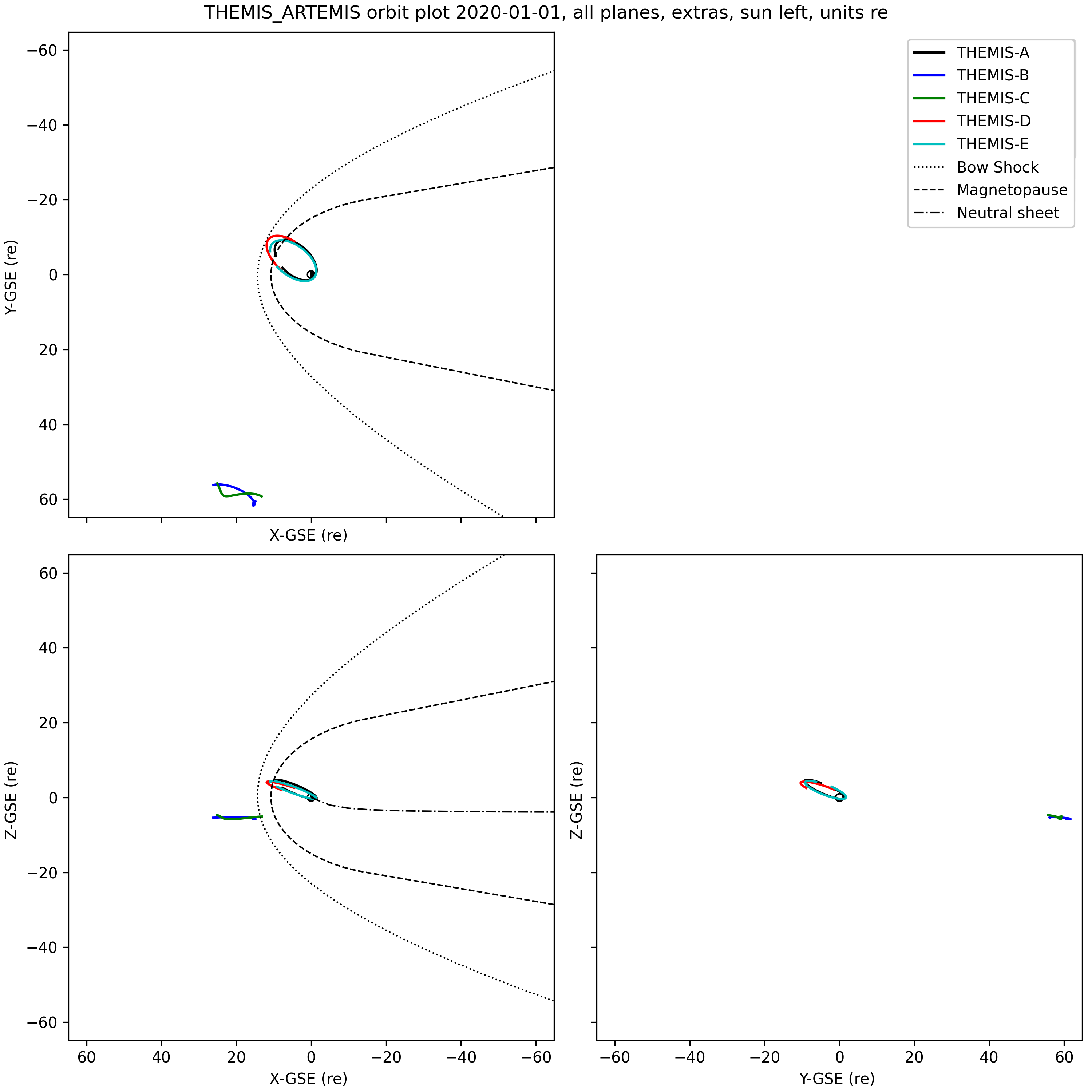
This example displays THEMIS and ARTEMIS orbits using tplotxy3, then adds the bow shock, magnetopause, and AEN neutral sheet location to the plots.
import pyspedas
from pyspedas import tplotxy3, tplotxy3_add_mpause, tplotxy3_add_neutral_sheet
from pyspedas.analysis.neutral_sheet import neutral_sheet
from pyspedas import bshock_2, mpause_2, get_data, store_data, set_coords, set_units, cotrans
import numpy as np

# Load THEMIS state data
default_trange = ["2020-01-01", "2020-01-02"]
pyspedas.projects.themis.state(trange=default_trange, probe=['a','b','c','d','e'])
# Calculate bow shock and magnetopause boundaries
bs = bshock_2()
mp = mpause_2()
# The neutral sheet is a little more complicated, since it's time-dependent. We'll pick the midpoint
# of the time interval
d=get_data('tha_pos_gse')
mid_time = (d.times[-1] - d.times[0])/2.0
# Generate a set of points along the -X axis (night side of Earth), units of Re
ns_x_re = -1.0*np.arange(0.0,375.0, 5.0)
# We need replicate the timestamps to make a proper tplot variable
times=np.zeros(len(ns_x_re))
times[:] = mid_time
ns_gsm_pos=np.zeros((len(ns_x_re),3))
ns_gsm_pos[:,0] = ns_x_re
# Generate the neutral sheet Z-axis values corresponding to the inputs
ns = neutral_sheet(times, ns_gsm_pos, model="aen", sc2NS=False)
# Add the Z component to the input positions, store it as a tplot variable
ns_gsm_pos[:,2] = ns
store_data('ns_gsm_pos', data={'x':times, 'y':ns_gsm_pos})
# We're making a GSE plot, but the neutral sheet is generated in GSM, so we do a cotrans
set_coords('ns_gsm_pos','GSM')
set_units('ns_gsm_pos', 're')
cotrans('ns_gsm_pos', 'ns_gse_pos',coord_in='gsm', coord_out='gse')
# Finally, we have the neutral sheet Z positions along the X axis on the night side.
gse_dat = get_data('ns_gse_pos')

# Plot the orbits and capture the resulting figure
fig = tplotxy3('th?_pos_gse',title='THEMIS_ARTEMIS orbit plot 2020-01-01, all planes, extras, sun left, units re', legend_names=['THEMIS-A','THEMIS-B', 'THEMIS-C', 'THEMIS-D', 'THEMIS-E'], reverse_x=True, plot_units='re', display=False)
# Add bow shock to figure
tplotxy3_add_mpause(bs[0],bs[1],fig=fig,legend_name="Bow Shock",color='k',linestyle='dotted',linewidth=1,display=False)
# Add magnetopause to figure
tplotxy3_add_mpause(mp[0],mp[1],fig=fig,legend_name="Magnetopause",color='k',linestyle='dashed',linewidth=1,display=False)
# Add neutral sheet to figure, then display the plot, and save it to a file
tplotxy3_add_neutral_sheet(gse_dat.y[:,0],gse_dat.y[:,2],fig=fig, legend_name="Neutral sheet",color='k',linestyle='dashdot',linewidth=1,display=True,save_png='orbits_thm_art_re_legends_extras_3planes.png')
Per-Variable Plot Options
- pyspedas.options(name, option=None, value=None, opt_dict=None, quiet=False)[source]
Set a large variety of options for individual plots.
- Parameters:
name (
strorlist[str]) – Names of tplot variables to be updated (wildcards accepted).option (
str, optional) – The name of the option. See the options section below.value (
str,int,float,list, optional) – The value of the option. See the options section below.opt_dict (
dict, optional) – This can be a dictionary of option-value pairs. ‘option’ and ‘value’ will not be needed if this dictionary item is supplied.quiet (
bool, optional) – If True, do not complain about unrecognized options.
Options
Many of the options are passed directly to matplotlib calls. For more extensive documentation about how to use these obtions, see the matplotlib documentation: https://matplotlib.org/stable/users/index.html
Note that many X-axis options are controlled at the level of the entire plot, rather than per-variable (since plots with multiple panels will share many X axis properties). See the tplot_options() routine for available per-plot options,
Panel Options
Value type
Notes
title
str
The title of the plot.
panel_size
flt
Number between (0,1], representing the percent size of the plot.
alpha
flt
Number between [0,1], gives the transparency of the plot lines.
line_width
flt
Sets plot line width.
line_style
str
scatter (to make scatter plots), or solid_line, dot, dash, dash_dot, dash_dot_dot_dot, long_dash.
border
bool
Turns on or off the top/right axes that would create a box around the plot.
var_label_format
str
The format of the tick labels if this variable is displayed as an alternative x axis. Default: {:.2f}
char_size
int
Defines character size for x/y/z titles and subtitles
right_axis
bool
If true,display a second Y axis on the right side of the plot.
second_axis_size
numeric
The size of the second axis to display
data_gap
numeric
If there is a gap in the data larger than this number in seconds, then insert
(cont)
(cont)
NaNs. This is similar to using the degap procedure on the variable, but is
(cont)
(cont)
applied at plot-time, and does not persist in the variable data.
annotations
dict
A dictionary or list of dictionaries of matplotlib text annotation parameters (see annotate() routine)
visible
bool
If False, do not display lines for this variable.
nodata
bool
If True, do not display lines for this variable.
Legend Options
Value type
Notes
legend_names
list
A list of strings that will be used to identify the legends.
legend_location
str
A string giving the location of the legend box.
legend_size
numeric
The font size of the legend names
legend_shadow
bool
Turns on or off drop shadows on the legend box
legend_title
str
The title to display on the legend
legend_titlesize
numeric
The font size of the legend title
legend_color
[str]
The color of the legend names
legend_edgecolor
str
The border color of the legend box
legend_facecolor
str
The background color of the legend box
legend_markerfirst
boolean
Put the marker and line to the left of the label in the legend
legend_markerscale
numeric
The scale size of markers displayed in the legend
legend_linewidth
numeric
The width of the lines displayed in the legend
X Axis Options
Value type
Notes
xtitle
str
The title to be placed under the x axis.
xsubtitle
str
The subtitle to be placed under the x axis
xtitle_color
str
The color of the x axis title.
xtick_length
numeric
The length of the x tick marks
xtick_width
numeric
The width of the x tick marks
xtick_color
str
The color of the x tick marks
xtick_labelcolor
str
The color of the x tick marks
xtick_direction
str
The direction of the x tick marks (in, out, inout)
Y Axis Options
Value type
Notes
y_range
flt/list
Two numbers that give the y axis range of the plot. If a third argument is present, set linear or log scaling accordingly.
ylog
bool
True sets the y axis to log scale, False reverts.
ytitle
str
Title shown on the y axis. Use backslash for new lines.
ysubtitle
str
Subtitle shown on the y axis.
ytitle_color
str
The color of the y axis title.
ytick_length
numeric
The length of the Y tick marks
ytick_width
numeric
The width of the Y tick marks
ytick_color
str
The color of the Y tick marks
ytick_labelcolor
str
The color of the Y tick marks
ytick_direction
str
The direction of the Y tick marks (in, out, inout)
y_major_ticks
[numeric]
A list of values that will be used to set the major ticks on the Y axis.
y_minor_tick_interval
numeric
The interval between minor ticks on the Y axis.
Error Bar Options
Value type
Notes
errorevery
numeric
Interval at which to show error bars
capsize
numeric
The size of error bar caps
ecolor
str
The color of the error bar lines
elinewidth
numeric
The width of the error bar lines
Marker/Symbol Options
Value type
Notes
marker_size
numeric
The size of the markers displayed in the plot
markevery
numeric
Interval at which to show markers
symbols
bool
If True, display as a scatter plot (no lines)
Z / Specplot Options
Value type
Notes
spec
bool
Display this variable as a spectrogram.
colormap
str/list
Color map to use for specplots https://matplotlib.org/examples/color/colormaps_reference.html.
z_range
flt/list
Two numbers that give the z axis range of the plot. If a third argument is present, set linear or log scaling accordingly.
zlog
int
True sets the z axis to log scale, False reverts (spectrograms only).
ztitle
str
Title shown on the z axis. Spec plots only. Use backslash for new lines.
zsubtitle
str
Subtitle shown on the z axis. Spec plots only.
ztitle_color
str
The color of the z axis title.
x_interp
bool
If true, perform smoothing of spectrograms in the X direction
x_interp_points
numeric
Number of interpolation points to use in the X direction
y_interp
bool
If true, perform smoothing of spectrograms in the Y direction
y_interp_points
numeric
Number of interpolation points to use in the Y direction
xrange_slice
flt/list
Two numbers that give the x axis range of spectrogram slicing plots.
yrange_slice
flt/list
Two numbers that give the y axis range of spectrogram slicing plots.
xlog_slice
bool
Sets x axis on slice plot to log scale if True.
ylog_slice
bool
Sets y axis on slice plot to log scale if True.
spec_dim_to_plot
int/str
If variable has more than two dimensions, this sets which dimension the “v”
(cont)
(cont)
variable will display on the y axis in spectrogram plots.
(cont)
(cont)
All other dimensions are summed into this one, unless “spec_slices_to_use”
(cont)
(cont)
is also set for this variable.
spec_slices_to_use
str
Must be a dictionary of coordinate:values. If a variable has more than two
(cont)
(cont)
dimensions, spectrogram plots will plot values at that particular slice of
(cont)
(cont)
that dimension. See examples for how it works.
Many options have synonyms or variant spellings that are commonly used. The first column gives the name that is used throughout the plotting code. The second column gives the synonyms that are accepted.
Canonical name
Accepted synonyms
title
name
line_color
color, colors, col, cols, line_colors
legend_names
labels, legend_name, legend_label, legend_labels
legend_location
labels_location, legends_location, label_location, labels_location
legend_size
labels_size, label_size
legend_shadow
labels_shadow. label_shadow
legend_title
label_title, labels_title
legend_titlesize
lable_titlesize, labels_titlesize
legend_color
legends_color, label_color, labels_color
legend_edgecolor
label_edgecolor, labels_edgecolor
legend_facecolor
label_facecolor, labels_facecolor
legend_markerfirst
label_markerfirst, labels_markerfirst
legend_markerscale
label_markerscale, labels_markerscale
legend_linewidth
label_linewidth, labels_linewidth
legend_frameon
label_frameon, labels_frameon
legend_ncols
label_ncols, labels_ncols
line_style_name
line_style, linestyle
char_size
charsize
marker
markers
marker_size
markersize
markevery
markerevery mark_every marker_every
symbol
symbols
line_width
thick
y_range
yrange
z_range
zrange
data_gap
datagap
spec_dim_to_plot
spec_plot_dim
var_label_format
varlabel_format
annotations
annotation
- rtype:
Examples
>>> # Change the y range of Variable1
>>> import pyspedas
>>> x_data = [1,2,3,4,5]
>>> y_data = [1,2,3,4,5]
>>> pyspedas.store_data("Variable1", data={'x':x_data, 'y':y_data})
>>> pyspedas.options('Variable1', 'yrange', [2,4])
>>> # Change Variable1 to use a log scale
>>> pyspedas.options('Variable1', 'ylog', 1)
>>> pyspedas.tplot('Variable1')
>>> # Multi-dimensional variable
>>> y_data = np.random.rand(5, 4, 3)
>>> v1_data = [0, 1, 3, 4]
>>> v2_data = [1, 2, 3]
>>> pyspedas.store_data("Variable2", data={'x': x_data, 'y': y_data, 'v1': v1_data, 'v2': v2_data})
>>> # Set the spectrogram plots to show dimension 'v2' at slice 'v1' = 0
>>> pyspedas.options('Variable2', 'spec', 1)
>>> pyspedas.options("Variable2", "spec_dim_to_plot", 'v2')
>>> pyspedas.options("Variable2", "spec_slices_to_use", {'v1': 0})
>>> pyspedas.tplot('Variable2')
- pyspedas.timebar(t, varname=None, databar=False, delete=False, color='black', thick=1, dash=False)[source]
This function will add a vertical bar to all time series plots. This is useful if you want to bring attention to a specific time.
- Parameters:
t (
floatorlist) – The time in seconds since Jan 01 1970 to place the vertical bar. If a list of numbers are supplied, multiple bars will be created. If “databar” is set, then “t” becomes the point on the y axis to place a horizontal bar.varname (
strorlist, optional) – The variable(s) to add the vertical bar to. If not set, the default is to add it to all current plots. (wildcards accepted)databar (
bool, optional) – This will turn the timebar into a horizontal data bar. If this is set True, then variable “t” becomes the point on the y axis to place a horizontal bar.delete (
bool, optional) – If set to True, at least one varname must be supplied. The timebar at point “t” for variable “varname” will be removed.color (
str) – The color of the bar.thick (
int) – The thickness of the bar.dash (
bool) – If set to True, the bar is dashed rather than solid.
- Return type:
Examples
>>> # Place a green time bar at 2017-07-17 00:00:00
>>> import pyspedas
>>> pyspedas.timebar(1500249600, color='green')
>>> # Place a dashed data bar at 5500 on the y axis
>>> pyspedas.timebar(5500, dash=True, databar=True)
>>> # Place 3 magenta time bars of thickness 5
>>> # at [2015-12-26 05:20:01, 2015-12-26 08:06:40, 2015-12-26 08:53:19]
>>> # for variable 'sgx' plot
>>> pyspedas.timebar([1451107201,1451117200,1451119999],'sgx',color='m',thick=5)
- pyspedas.databar(varname, y=0.0, delete=False, color='black', thick=1, dash=False)[source]
This function will add a horizontal bar at the given value to a plot of a tplot variable.
- Parameters:
y (
floatorlist) – The Y-axis value If a list of numbers are supplied, multiple bars will be created.varname (
strorlist) – The variable(s) to add the vertical bar to. (wildcards accepted)delete (
bool, optional) – If set to True, at least one varname must be supplied. The timebar at value “y” for variable “varname” will be removed.color (
str) – The color of the bar.thick (
int) – The thickness of the bar.dash (
bool) – If set to True, the bar is dashed rather than solid.
- Return type:
Examples
>>> # Place a green time bar at 2017-07-17 00:00:00
>>> import pyspedas
>>> pyspedas.databar('*', 0, color='green')
>>> # Place a dashed data bar at 5500 on the y axis
>>> pyspedas.databar('*', 5500, dash=True)
>>> # Place 3 magenta time bars of thickness 5
>>> # at -100, 0, +100
>>> # for variable 'sgx' plot
>>> pyspedas.databar('sgx', [-100, 0, 100],color='m',thick=5)
“Global” plot options
- pyspedas.tplot_options(option, value)[source]
This function allows the user to set GLOBAL options for the generated plots.
- Parameters:
option (
str) – The name of the option. See section belowvalue (
str/int/float/list) – The value of the option. See section below.
Options
Option (Synonyms)
Value type
Notes
title_text (title)
str
Title of the entire plot (mpl ‘suptitle’, above any panel titles)
title_size
int
Font size of the title
data_gap
int
Number of seconds with consecutive nan values allowed before no interp should occur
x_range
[flt, flt]
The min and max x_range (time) to be plotted on all plots
axis_font_size
int
The font size of the axis ticks. Default is 10.
charsize
int
The font size for the legend strings
style
str
The matplotlib plot style to use
xsize
flt
The size of the plot window in the X dimension (units of inches)
ysize
flt
The size of the plot window in the Y dimension (units of inches)
xmargin
[flt, flt]
The width of the left and right margins of the plot (in inches)
ymargin
[flt, flt]
The height of the top and bottom margins of the plot (in inches)
annotations
dict
A dictionary of text, positions, xycoords, and other options to be placed on the plot
varlabel_style
str
Set to ‘extra_axes’ for each variable on its own axis, or ‘extra_panel’ for a more compact display in a single panel
- rtype:
Examples
>>> # Set the plot title
>>> import pyspedas
>>> pyspedas.tplot_options('title', 'SWEA Data for Orbit 1563')